As promised, it's time to take a step back from forecasting and projecting and look at how the model has performed since I rolled it out in Gameweek 8. There are three ways to look at this:

- Look at each player's weekly forecast score versus their actual weekly score
- Look at each player's aggregated forecast score versus their actual aggregated score
- Look at each player's average forecast score (per 90 minutes) versus their average actual score
Each measure has it's advantages and disadvantages but I will throw the first option out as any model is simply not going to be accurate enough on a weekly basis enjoy great success. Of course, we can use its outputs to forecast the probability of different players' chance to succeed but even if it was perfect we'd still see massive fluctuations. So that leaves options two and three which each have some advantages: option two is the truest comparator of how the model performed over the period while option three does a better job at accounting for the fact that players don't play every week. As a compromise, I am comparing points on a total basis but I've thrown out all games where players played 45 minutes or less as they tend to mess up the correlation stats and aren't really representative of what the model is trying to achieve. Trying to forecast decisions by the likes of Mancini need a more powerful computer than a MacBook.
 I'm not going to run through individual players but if you would like to discuss a player in more detail, feel me to do so in the comments. A few high level points:
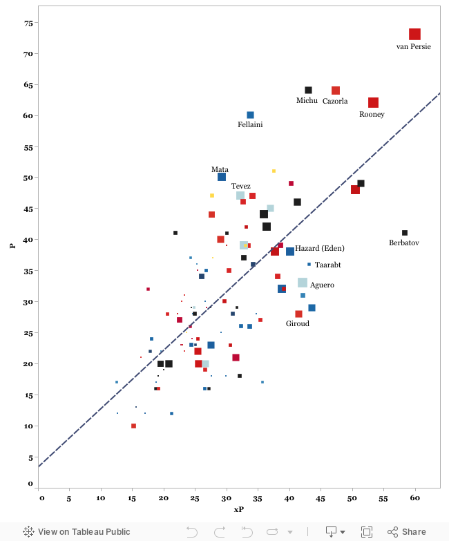
- The model seems to be performing quite well, and if we limit ourselves to players who have racked up 450 or more minutes, we see a 70% correlation and 0.5 r-squared which are reasonable (though hardly indicative of a perfect model)
- The fact that the line intersects the y-axis at ~three points suggests that the xP measure is probably underestimating scores across the board. This is reasonable for a couple of reasons. One, the model is based on average outcomes and thus will never forecast the kind of 23 point performance we saw from Cazorla this week. Second, I currently crudely account for bonus points by simply awarding 1.5 points per goal (the average points earned for a goalscorer). In reality of course, a goalscorer will often earn all three points for a scoring effort which can impact scores here, particularly at the top end of the market.
The main trend most people will observe is that the 'elite' players are above the line and thus the model is tending to undervalue them. In some ways, mainly due to the aforementioned issues in point two above, this is true and I'd be happy to concede that some more work is needed to better apportion bonus points (which will overwhelmingly flow to elite players) and perhaps reduce the regression rates if we can establish that the elite players really can exceed league average in terms of goals per shot on target with any true consistency.
That said, we need to be careful not to get caught up in confirmation bias by anointing those players with high scores as 'elite' (are we doing so because of their talent of because of their recent points hauls?). Rooney and van Persie are obviously some of the league's best players but it's fair to say that Fellani and Michu wouldn't have been in that conversation at the start of the season, while many were getting frustrated with Cazorla until his huge haul this week. While there's no doubting there could be something here, other 'elite' players like Suarez, Ba and Hazard have essentially performed in line with the model, with Aguero significantly below, so it's overly simplistic to simply state that the model is too harsh at the top end of the market.
In terms of using this information, this graph should not necessarily be used as a indication of future regression. For example, if a player steadily increased his shot production over this period, the model would always be behind in terms of forecasting his production and by the end of the period his points would reasonably (and sustainably) outshine his xP. It can however be used to spark those conversations though, and to help us look into players who might regress, but it's not as simple as everyone regressing towards that trend line.
Overall, I'm pleased with these results and they form a good starting point for future developments. If we look at the distribution of variances we see that they form somewhat of a familiar bell curve, without too many huge variances at either end of the spectrum. 79 of the 104 players in the sample fell within 10 points of the expected points, which isn't too bad over a 10 week period.

The next step is look at tweaking the formulas to try and understand those variances at the top end of the chart and determine how much of the difference is attributable to their true skill exceeding the average and how much is attributable to confirmation bias and revisionism. As always, any suggestions are welcome, and I'll do another update like this in a few weeks to report back on any updates or developments.
No comments:
Post a Comment