After posting a review of the latest model, reader Agnar had the excellent suggestion of not just comparing the model to actual results, but benchmarking it against another simpler forecast system, likely employed by large sections of fantasy managers. As suggested, a simple and useful method here is to simply take the points per game (actually points per 90 minutes to avoid the odd sub appearance skewing things) accumulated in gameweeks 1-7 and then comparing that rate to the actual rate delivered in gameweeks 8-17. We can then plot that side by side with the model analysis and see (a) which is better, and (b) if there are any specific areas in which the model succeeds/fails.
The first graph shows the P90 for gameweeks 1-7 plotted against the P90 for gameweeks 8-17 (filtered to only include players who racked up 600+ minutes). The second graph shows the forecast points for gameweeks 8-17 from the model plotted against the actual P90 for gameweeks 8-17 (again, limited to players with 600+ minutes).
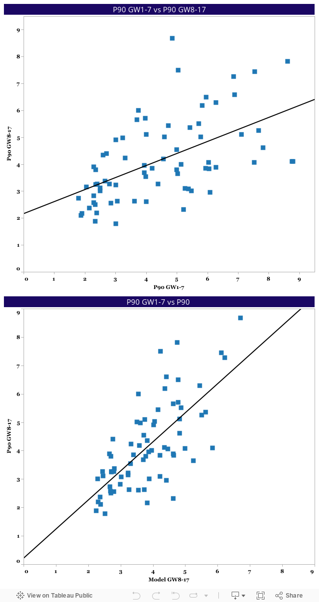
I'm pleased to say that the model looks quite a lot stronger than simply looking at historic points to date, and while that's hardly proof that the model is somehow a perfect forecasting tool (it very much isn't), it's good to know we're improving on the status quo method used by many a manager across the world (i.e. points chasing). A couple of specifics on the two charts:
Model | P90 Historic | |
| Correlation | 66% | 53% |
| r-squared | 0.50 | 0.30 |
| Standard deviation | 0.7 | 1.1 |
| Players within one P90 | 67% | 52% |
The big outliers from the model forecast are those who are generally considered 'elite' or at least 'in form' (whatever that means). While this is a problem in that they're the players we obviously need to target for our respective fantasy teams, it's encouraging that a certain type of player are being mis-evaluated by the model, as this gives us an opportunity to tweak things and forecast them better (in some cases it probably isn't mis-evaluation and simply a case of unforecastable luck). The historic forecast on the other hand sees all kinds of players with bad forecasts, which can be explained by either initially high conversion rates, easier fixtures or a change in playing time/role.
I'd hope that anyone looking at this data regularly was confident it was providing them with something stronger than simply looking at the points table, but at least this analysis tries to quantify that advantage. With 66% correlation and only a 0.5 r-squared, we're far from announcing the model as a total success just yet, but given that the above is based on small samples there's reason to believe these rates will improve as we get more data (comparing the model on a pure total points basis rather than per 90 minutes rate also improves things, with a correlation of 72% for all players excluding games below 45 minutes).
No comments:
Post a Comment